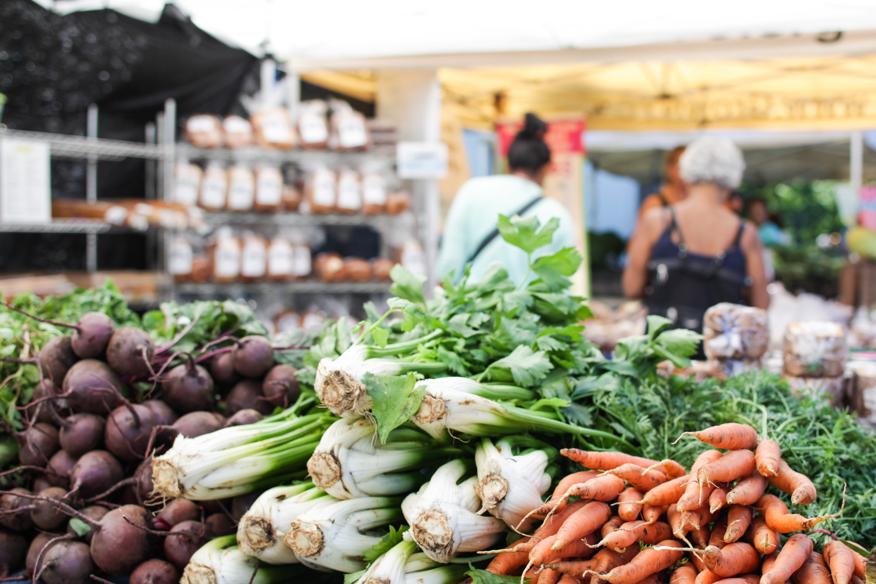
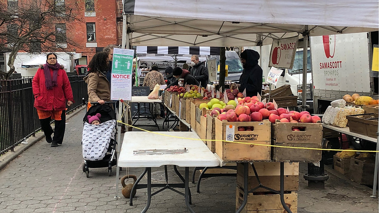
Empty grocery store shelves are one of the many consequences of the COVID-19 pandemic. As a result, access to food and healthy food has been a challenge and has become an even more pressing challenge for individuals [1]. Generally, access to healthy food by low income communities has already been a persistent issue in New York City. Notably, the borough of Queens has gained attention for the food deserts and the limited healthy options in the borough for lower income communities when it comes to food [2].
Hence, in order to analyze the accessibility of healthy food options, the distribution of farmers markets was explored as one option for communities in Queens to access healthy food. Specifically, the distribution of farmers markets in Queens and the median income within the borough were analyzed. The distribution of farmers markets were observed in terms of their proximity to public transportation along with the travel distance between the farmers markets in Queens and the areas that are within a walkable distance. Furthermore, the distribution of grocery stores and food pantries were also briefly explored.
Methodology
Through NYC Open Data, New York City provides information on farmers markets within the five New York City Boroughs. Additionally, NYC Open Data provides information on subway station locations and the subway lines that run throughout the city; census tracts; borough areas; neighborhood boundaries; and zip code boundaries. 2018 ACS and 2010 Census data provided information on median income by household and total population. For data taken from the ACS, such as median income, margins of error were not displayed or extensively discussed in the analysis of this project. Additionally, since the total population by census tract may be attributed to the geographic size of each tract, the percentage of the population is calculated based on the total population of Queens. While this does not necessarily eliminate the influence of geographic scale, the percentages provide a way to compare areas of the borough using the same unit. If I was able to obtain data on population density per square mile for all tracts, this would have been ideal.
To display the median income and population by census tract, these data were joined with the census tract shape files in order to display these demographics on choropleth maps. Neighborhood boundaries for Queens were outlined when appropriate in order to analyze areas of the borough. Locations of farmers markets and subway stations/lines were then displayed on the maps. Data on farmers markets were filtered by location by borough to highlight or focus only on farmers markets in Queens when appropriate. Note for choropleth maps displaying median income by household size by census tracts and population percentage, tracts where no data was reported do not display any data for the given area.
:max_bytes(150000):strip_icc()/GettyImages-532527755-eb55ee47737c40d9964c7a9f4c2b3412.jpg)
First, this project looks at the distribution of farmers markets by borough. In order to count the number of farmers markets per borough, the location of the farmers market dataset was intersected with the borough areas and then counted. The farmers market data contained information on whether or not markets accepted electronic benefit transfers (EBT) or Supplemental Nutrition Assistance Program (SNAP) benefits. EBT and SNAP enables low-income individuals who qualify for these federal programs to purchase food at participating food establishments using an EBT card [3]. Next, I looked at the accessibility of farmers markets by walking and subway. For finding the travel distance within a 0.5 and 1 mile radius from farmers markets, distance buffers were created. The analysis method that does this in CARTO creates an isoline—a straight line travel buffer from the farmers market location—for a given distance or 1 mile in this case [4]. Then, to find the nearest farmers market to a subway station on the subway line, the nearest linear distance between a station and a farmers market was calculated [5]. Note that due to the limitations of the analysis that can be done in CARTO, the measurement of the distance between a subway station and a farmers market is not provided, but rather the nearest markets are identified.
Finally, this project briefly looks at the distribution of grocery stores and food pantries in Queens. Data on retail food stores in the state of New York from data.ny.gov was cleaned and filtered to obtain grocery stores located in Queens. The data was first filtered to obtain all retail food stores in Queens county. The data was then filtered by the operation type the store was categorized as along with stores that were labeled as “grocery” or “supermarket” in the “Doing Business As” (DBA) category. The stores were then grouped by zip codes within Queens and totaled, which was then displayed on a map of zip codes in the borough. Obviously, the geography of each zip code could influence the number of stores within a given zip code area. If the specific locations of the stores could have been identified, this would have allowed for deeper analysis about the distribution of stores. However, the total number of grocery stores still allowed for insight on store distribution. Lastly, a map of food pantries in New York City provided by the Food Bank for New York City was analyzed.
Distribution of Farmers Markets by Borough
First, I looked at the distribution of farmers markets by each New York City Borough with median income of census tracts in Queens. Lower income communities have historically had less access to healthy food options [6]. Therefore, I predicted that farmers markets would be located in higher income areas in Queens and that more farmers markets.
Source: NYC Open Data “DOHMH Farmers Markets” (2020), “2010 Census Tracts,” and ACS (2014-2018) Table B19019
The map above shows Queens has the second lowest number of farmers markets among the five New York City boroughs, with 22 markets. Manhattan has the greatest number of farmers markets, with 41 markets, and Staten Island has the lowest number of markets, with 4 markets. However, the farmers markets in Queens seem to be distributed among areas with lower median income tracts and actually appear to be underrepresented in higher median income tracts. In addition, all farmers markets located in Queens accept Electronic Transfer Benefits (EBT). This could suggest that farmers markets have been strategically located in areas with lower income communities.
Accessibility of Farmers Markets by Walking and Subway
While the previous map suggested that farmers markets were distributed among areas with lower median incomes, I wanted to see how accessible these markets were by walking and by subway. The US Department of Transportation states that people are typically willing to walk 0.5 miles to the nearest transit station and other studies have concluded that 0.25 miles is considered a reasonable walking distance to a destination [7]. In order to assess the walking distance between farmers markets and median income within neighborhoods, distance buffers were created with a 1 mile radius to see which areas were within a 0.5 and 1 mile radius from the farmers markets.
Source: NYC Open Data “DOHMH Farmers Markets” (2020), “2010 Census Tracts,” and ACS (2014-2018) Table B19019
The map above shows how the majority of farmers markets are within 0.5 mile of neighborhoods with lower median income, such as Flushings, Corona, Jackson Heights, Elmhurst, and East Elmhurst. Many of the distance buffers overlap in areas with lower median incomes, suggesting that these areas have access to multiple options within 0.5 miles. Nevertheless, it is evident that certain neighborhoods or areas within neighborhoods with lower median incomes are 1 mile or more away from a farmers market. Thus, accessing these farmers markets and transporting items from these markets may still be a challenge without a vehicle. Furthermore, neighborhoods with higher median income, particularly in the north and southeast neighborhoods of Queens, are more than 1 mile away from a farmers market. Although these neighborhoods may have higher median incomes, residents whose income is below the median income may still face barriers when trying to access farmers markets. Although Queens has a higher number of car owners and residents who commute by car than the other boroughs, other factors such as age and ability may still be obstacles for accessing farmers markets [8]. Moreover, it is important to note that the distance buffers do not take into consideration the buildings or paths that actually lead to the location of the farmers markets.
Since farmers markets seemed to be distributed among areas in Queens with lower median incomes, I looked at the population percentage by census tract for farmers markets that were near subway lines in order to gain a deeper understanding of the amount of people that could access the markets.
Source: NYC Open Data “DOHMH Farmers Markets” (2020), “Subway Stations,” “Subway Lines,” “2010 Census Tracts,” and 2010 Census Table P1
The map illustrates how the majority of farmers markets in Queens along with markets in Manhattan, Brooklyn, and the Bronx, are located directly next to or nearby the subway line. This indicates that farmers markets are in areas accessible by transportation and that residents in a borough also have access to farmers markets that are beyond their neighborhood or borough. Of course, transportation fees and walking distance can still be barriers for people whose homes are further away from the subway or for those who cannot afford subway fees.
For Queens, 19 of the 22 farmers markets in the borough are within 0.5-1 miles from subway stations. In relation to the population of Queens, the markets closest to the subway stations and the subway line itself appears to run through neighborhoods and markets located in neighborhoods with higher percentages of the population living in those areas.
Distribution of Grocery Stores and Food Pantries
Farmers markets provide a way for residents to obtain local and healthy food while also supporting local farmers. However, farmers markets are not open everyday and when unforeseen events like a pandemic occur, access to farmers markets may not be consistent. With the pandemic causing a surge of people shopping at grocery stores and utilization of food pantries, along with halting of operations at farmers markets [9], I wanted to briefly look at the number of grocery stores and food pantries within Queens. Grocery stores can provide consistent access to residents and potentially allow farmers who sell at the farmers market partner with local grocery stores.
I predicted that grocery stores and food pantries would be located throughout the borough, but would have a higher concentration in the northwestern part of Queens as these neighborhoods have been historically lower income neighborhoods.
Source: NYC Open Data “Zip Code Boundaries” (2018) and data.ny.gov “Retail Food Stores” (2019)
The map above displays the number of grocery stores by zip code along with the location of farmers markets. While zip codes have different geographic areas, the number of grocery stores in each area of Queens can still provide some insight into the distribution of grocery stores in the borough. Specific locations of grocery stores in New York State can be found here (you can Zoom in to Queens to see the locations of all retail food stores). Based on the map shown above, the areas with the most grocery stores appear to be the northwest and southern areas of the borough. The zip codes around Corona and Glendale have the highest number of grocery stores, with 10% and 9% of all grocery stores represented in the area, respectively. The high number of grocery stores within the northeast area of the borough correlates with the higher amount of farmers markets in the area, but the median income by census tract in this area tended to be lower than the average median income. In contrast, the southern area of Queens had higher median incomes, but also had a higher number of grocery stores in the area compared to other parts of the borough. Interestingly enough, the zip codes with fewer grocery stores tended to be in neighborhoods with higher income.
Food pantries (orange), soup kitchens (dark blue), mobile pantries (yellow), mobile soup kitchens (light blue), senior services (purple), and home delivery services (green) in New York City. Source: Food Bank for New York City
The map provided by the Food Bank for New York City displays the types of food services provided throughout the city. Based on the map, we can see that most food pantries in Queens are located in the northwest and southeast areas of the borough. These areas correspond to the areas with lower to middle median income (northwest area of Queens) and the areas with higher median income (southeast area of Queens). There appears to be more pantries that are in closer proximity to each other in the southeast neighborhoods of Queens, but the northwest neighborhoods have more soup kitchens, particularly in the Elmhurst, Corona, and Jackson Heights neighborhood.
In contrast to the northwest and southeast areas of Queens, the southwest and northeast areas of Queens appear to have the least amount of food pantries available. For instance, neighborhoods like Forest Hills, Middle Village, and Murray Hill have few pantries within the area. These neighborhoods had middle to higher median incomes compared to the other areas of Queens, however this may mean that those with lower incomes in these neighborhoods may have to travel further to reach food pantries.
Ethical Considerations
The correlations between different demographics and features shown throughout this project begins to highlight areas in Queens that have access to food and areas that may face challenges to accessing food. The way the neighborhoods and areas in Queens can have implications when it comes to policies surrounding food and food services. Additionally, how the neighborhoods and areas in Queens have been represented must be evaluated in order to ensure these communities and their needs are being accurately illustrated.
As previously discussed in the Methodology section of this project, there are limitations and questions that need to be asked about the data being used. 2018 ACS data for median income contains margins of error that complicate the conclusions that can be drawn about the economic state of communities. Additionally population data was taken from the 2010 Census and the population and demographics of Queens has evolved between the time these data were collected and the present. Hence, the needs of certain communities may have also shifted. Moreover, data on farmers markets and grocery stores were collected by agencies at the city and state level, meaning that the markets and stores represented in these data met the criteria set by the departments collecting the information. Although people may be in proximity to the resources represented in these data, we cannot necessarily assume these are the resources most frequently used.

Moreover, this project suggests neighborhoods or areas in Queens with lower median income tracts appear to be in proximity to farmers markets and transportation to access farmers markets. Additionally, zip codes with higher numbers of grocery stores were also located in these areas. While this may indicate that residents in these areas therefore have access to food, the quality and frequent availability of food is not evident based on the research conducted.
Conclusion
Ultimately, my hypotheses that more farmers markets and grocery stores would be located in higher income areas did not appear to hold true. Farmers markets appeared to be located in areas with lower to middle range median incomes and further away from higher income areas. While more grocery stores appeared in zip codes for areas with lower median income, grocery stores were still distributed throughout the borough. Similarly, food pantries appeared to be distributed across the borough too.
This project ultimately highlighted the access to farmers markets and briefly observed the distribution of groceries and food pantries. Given the challenges the COVID-19 pandemic presents, questions of what is still accessible arise. Further research on: the current operations of the facilities displayed throughout this project; the quality of services; and policies that help those who need financial assistance to obtain food will be needed to ensure farmers markets and food in general continues to be accessible.
Sources
[1] https://www.nytimes.com/2020/04/08/business/economy/coronavirus-food-banks.html
[2] https://www.amny.com/queens/local-food-organizations-create-long-island-city-pantry-supply-2000-western-queens-families-with-fresh-produce/; https://qns.com/story/2018/11/26/queens-neighborhoods-citys-highest-levels-food-insecurity/; https://www.ny1.com/nyc/all-boroughs/news/2020/05/02/hundreds-line-up-for-blocks-in-queens-for-free-food-distribution
[3] https://www.benefits.gov/benefit/361
[4] https://carto.com/help/tutorials/create-travel-distance-buffers/
[5] https://carto.com/help/tutorials/find-nearest/
[6] https://www.ers.usda.gov/topics/food-choices-health/food-access/; https://www.ers.usda.gov/publications/pub-details/?pubid=93140
[7] https://safety.fhwa.dot.gov/ped_bike/ped_transit/ped_transguide/ch4.cfm; https://www.ncbi.nlm.nih.gov/pmc/articles/PMC3377942/
[8] https://edc.nyc/article/new-yorkers-and-their-cars
[9] www.bloomberg.com/news/articles/2020-04-01/there-s-no-good-reason-to-hoard-anythin
G-especially-food; www.usatoday.com/story/money/business/2020/04/04/coronavirus-tests-americas-food-su
Lauren Hom
CP 101 Assignment 3
Spring 2020
